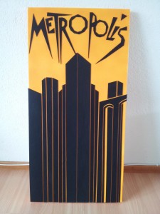
Metropolis Redesign
Months ago I saw an episode of the TV-series "How I met your mother" and in that episode Ted had a movie poster of Metropolis in his room. This reminded me how much I liked the movie and the poster. But I found the original poster a little too crowded and I especially disliked the golden robot. Because of that I decided to redesign the poster. After finishing the design, I painted a canvas with the background color. Then I cut the foreground objects out of cardboard, painted them black and glued them onto the canvas. The final result looks like this:

The first design was the one on the left side, but in the end I decided for the much more reduced version on the right side:

